Miradore
︎︎︎ 360' Rebranding, 2021


Client
Trusted by over 10,000 organizations in more than 180 countries, Miradore is a Finnish cloud-based Mobile Device Management platform that provides a smarter way to securely manage both company-owned and personal Android, iOS, macOS, and Windows devices.
Trusted by over 10,000 organizations in more than 180 countries, Miradore is a Finnish cloud-based Mobile Device Management platform that provides a smarter way to securely manage both company-owned and personal Android, iOS, macOS, and Windows devices.
Brief
Strategic brand design / Strong and consistent visual identity throughout all marketing material in print and digital mediums.
I Brand discovery / Brand definition;
Setting the strategic foundation before moving into the creative development of visual identity and brand guidelines.
II Visual identity
Brand look & feel / Defining
' Brand colors
' Brand typography
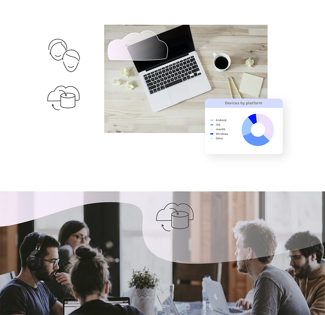
' Use of imagery
' Direction for web design
' Direction for photoshoots
' Unique illustrated brand visuals
Digital deliverables
' Graphic guidelines
' Web layouts; landing page, product pages
' Illustrations
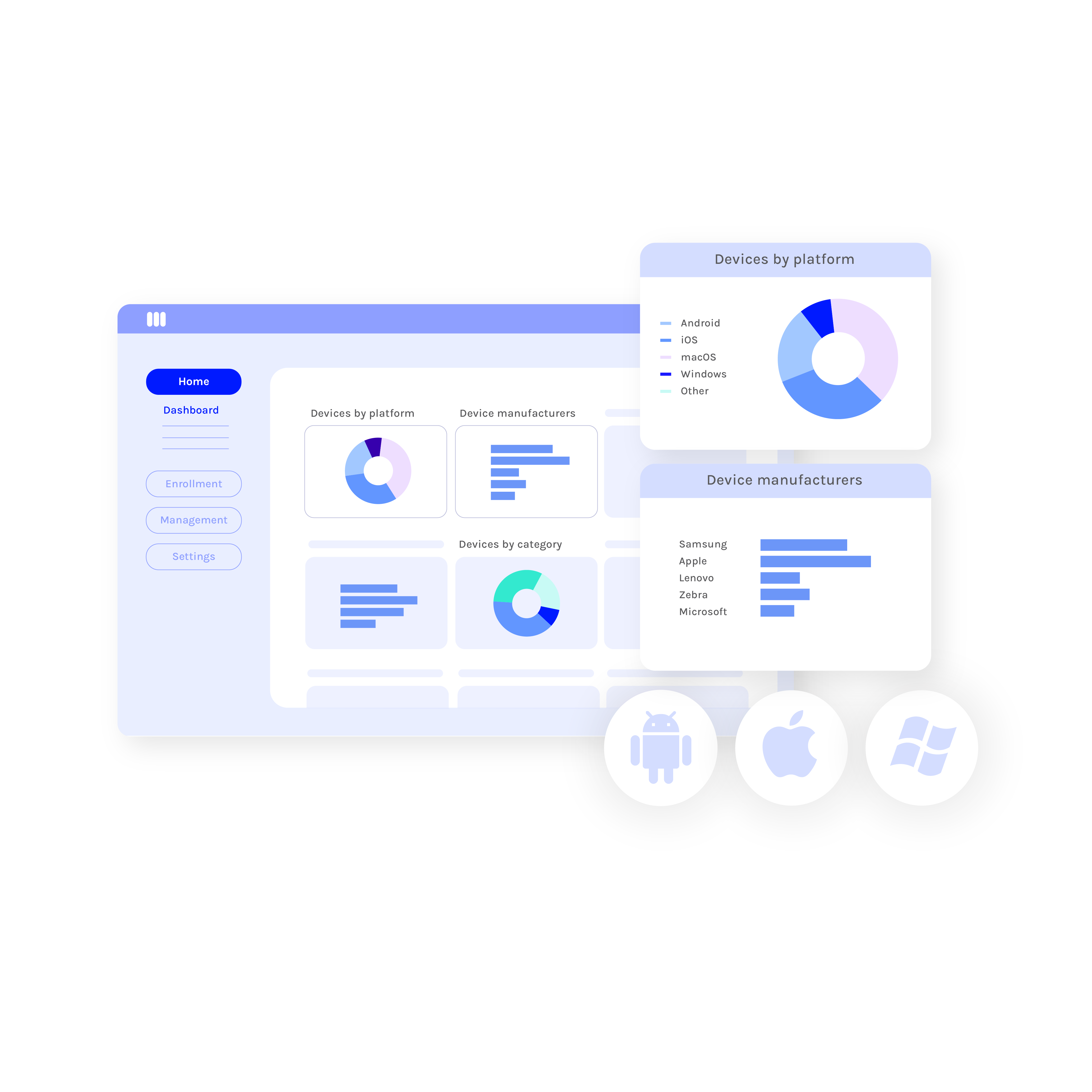
__ Custom UI illustrations,14 visuals
__ Unique brand pictograms
__ Landing page hero visual
' Presentation templates
Print material
' Business cards
' Unique branded coffee packagings
' Illustrated brand postcards
' Art direction for brand imagery and staff photoshoots
III Brand guidelines
Objectives
The identity refresh aimed to make Miradore's brand presence more approachable. The main objective was to build a strong visual identity that feels human, genuine and secure for customers to engage with, while establishing visual consistency across all marketing touchpoints.
Design Approach
The visual identity aims to embrace a clean and Scandinavian aesthetic with a professional and soft touch, characterized by custom designed brand illustrations and user friendly design principles.
By maintaining warmth in the visual language and building a strong style through recognizable brand elements, the visual identity reflects Miradore's service values and user experience philosophy.


S